Glanceable Stock Trading User Flow
Duration: 2 days
Project Contributions:
Liam Melin-Higgins and Olof Ingelsten participated in brainstorming process.
Wilhelm Helmersson helped with editing film.
Overview
The purpose of this project was to design a glanceable user flow with the behaviour of a multi-screen UI through rapid prototyping.
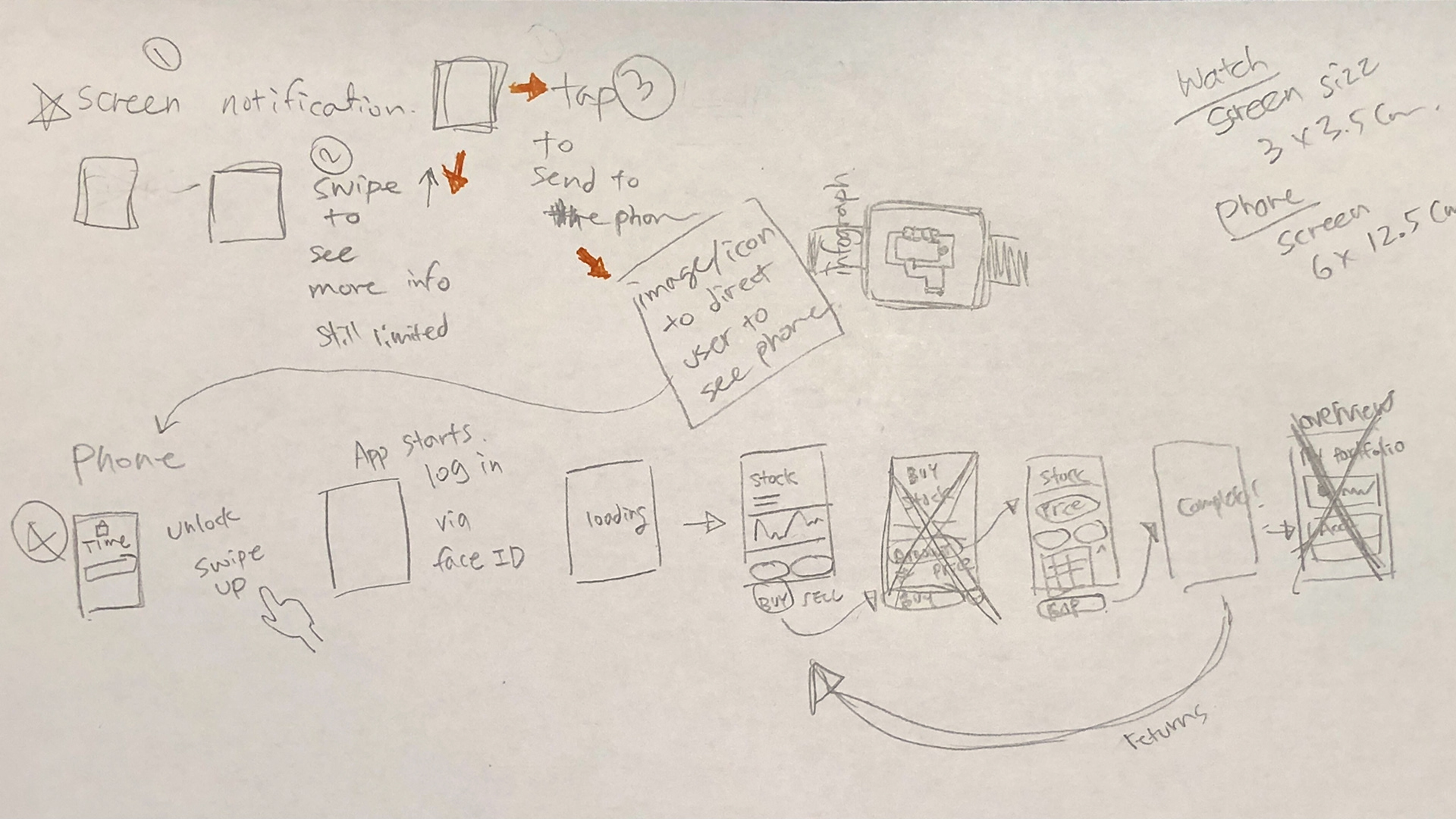
The user flow is quite simple as I only wanted to show how a person would handle a single task. The users can decide whether they will engage after glancing at a notification, which in this case, the user decides to take an action of buying a stock after getting a price alert.
Design Opportunity
I have not yet came across an existing stock trading app that communicates between a phone and smartwatch, but it is critical to know when a certain stock reaches a specific target price without having to manually check the phone because the user would miss the critical entry point.
User Flow
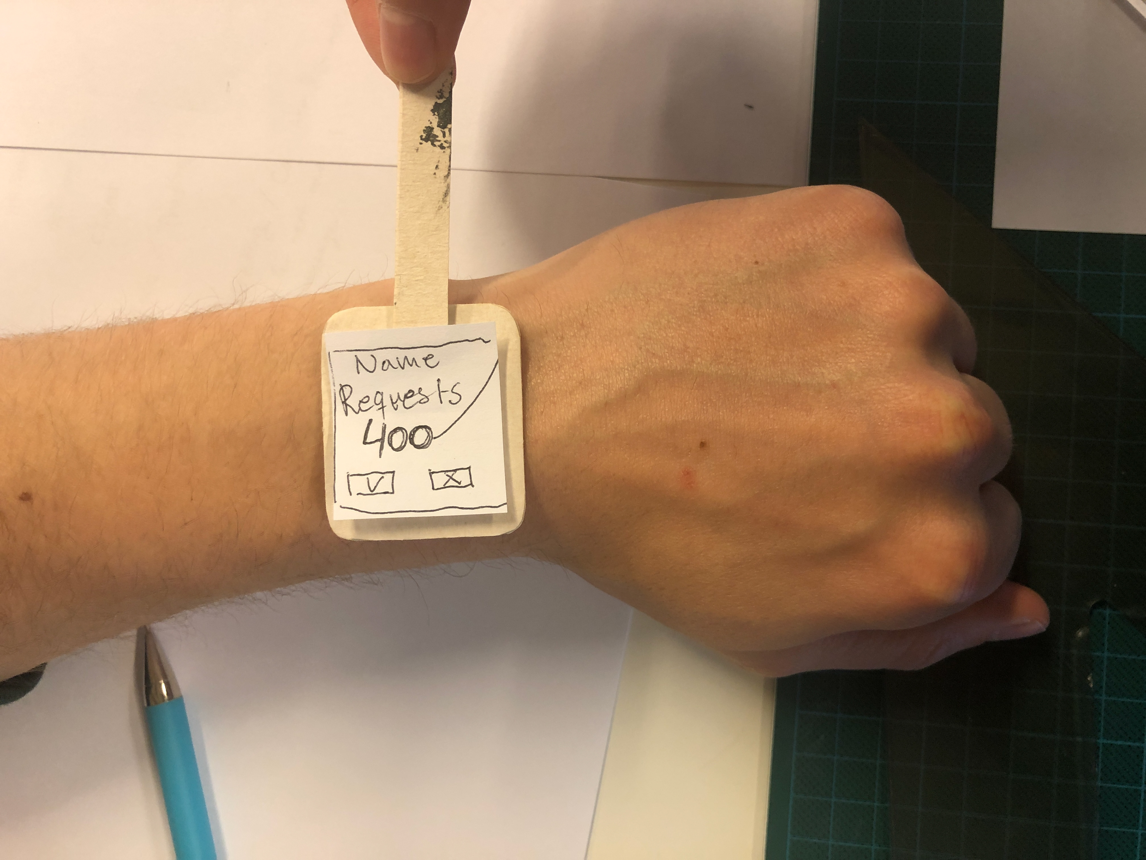
Our main situation is receiving the stock price alert and taking active action to complete a task. In this case, the user will purchase a stock after getting his notification.
Paper Prototyping
For interface design, I researched popular stock market app such as Avanza, Webull, CNBC, Yahoo! Finance, and decided to benchmark Avanza. After that, I drew quick sketches of wireframes and tested how it would look on 1:1 screen sizes on iPhones and Apple Watch.
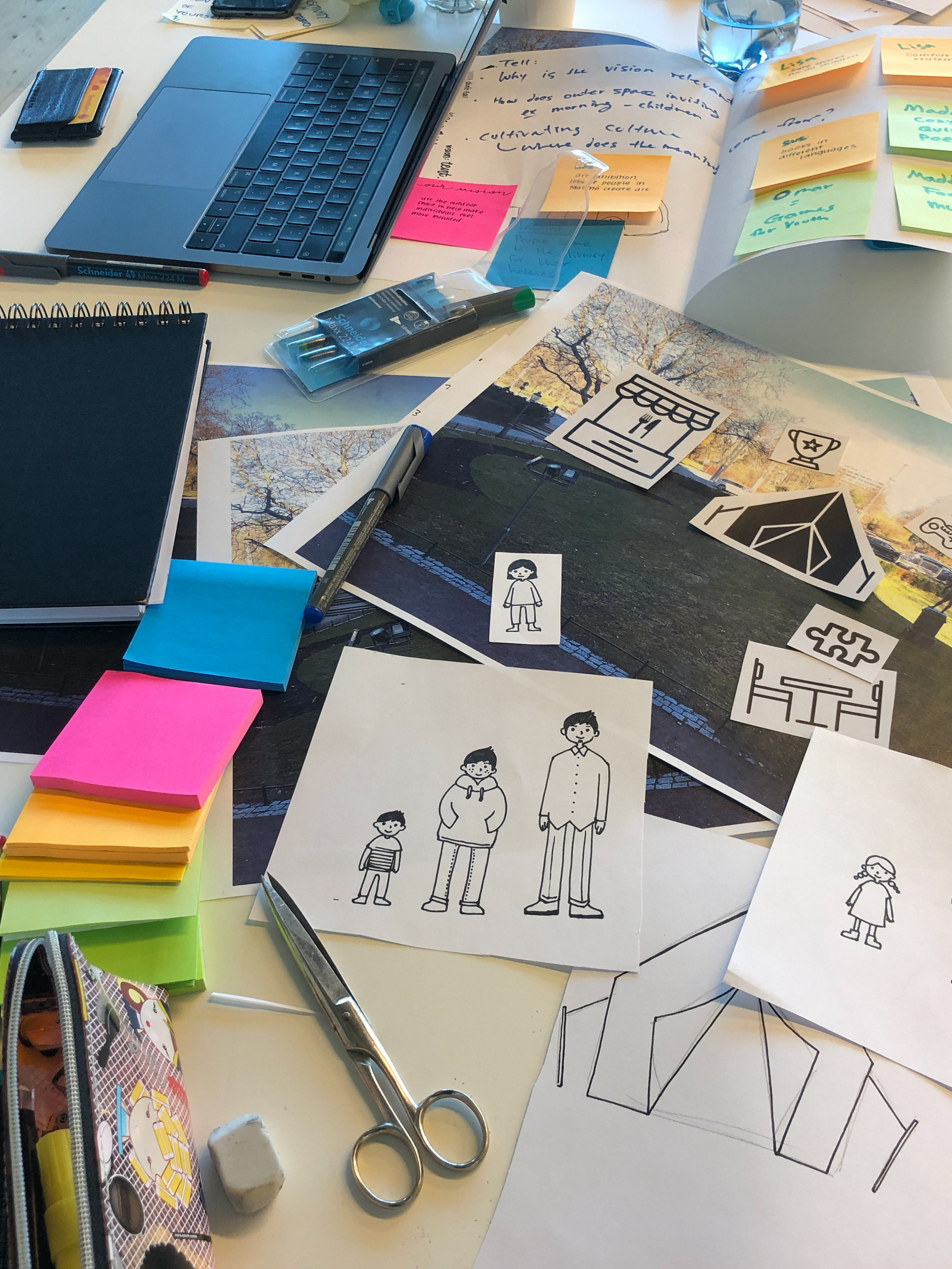
I used pencil, eraser, pen, markers, scissors, knife, rulers, tape, cutting mat, and various papers.
I chose Apple interface environment because app developers test their products on Apple store first. Although there are larger android users, the devices are more segmented, unlike Apple.
Future Work
It would be great to test whether it is possible to perform the main action of quick purchase/sales of the stocks via smartwatch only.

