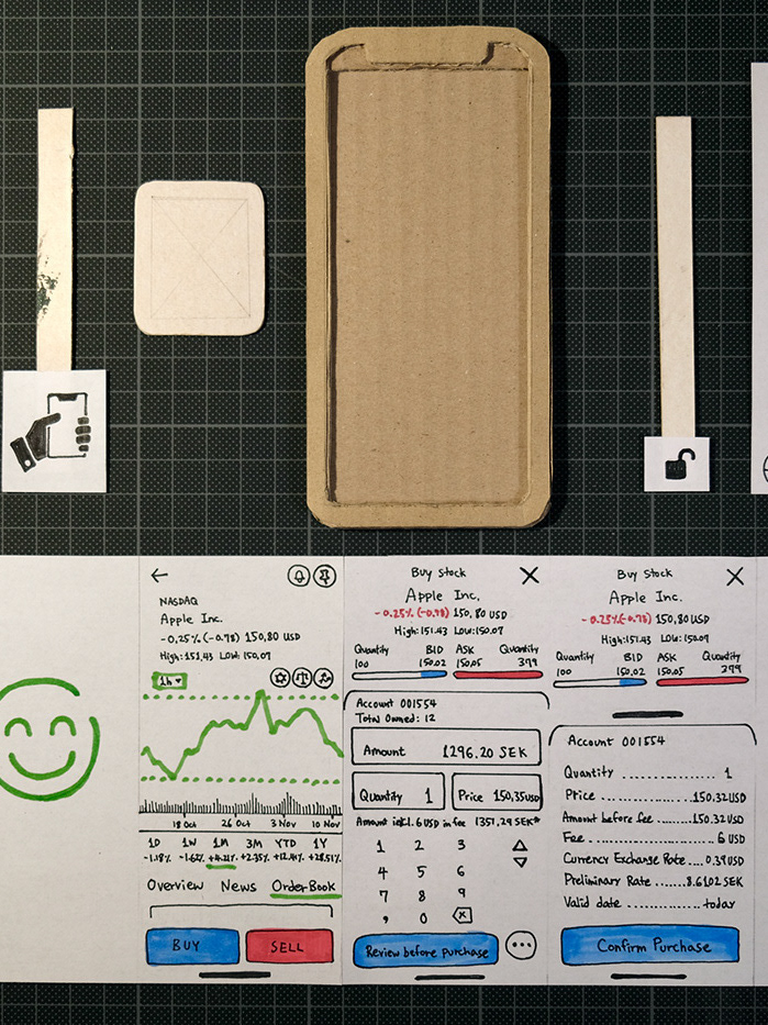
GUI vs. TUI
User Engagement and Positive Lifestyle Changes
About this Project
What
In comparison to graphic user interfaces (GUI), how might tangible user interfaces (TUI) help strengthen a sense of commitment and improve user engagement to carry out a plan?
Why
Some studies argue that the advantage of TUI over traditional GUI is still unclear, while others state that physicality of the TUI increases enjoyment and has a stronger potential for engagement. Inspired by Fogg Behavior Model (FBM) and Self-Determination Theory (SDT), this project attempts to compare these two arguments.
Duration
5 weeks
Limitations
1. Although self-motivation is key to successful lifestyle changes, it is not possible to confirm whether the users truly want to make changes or not.
2. Not everyone is in the same environment, which can affect the level of friction and ease of access.
3. The scope of this project cannot measure the long term changes. Instead, we make assumptions based on early results regarding the effectiveness of interfaces.
4. The A/B comparison test has been performed in a small unit, which can bias the result.
Methods
This project followed a user-centered design process, utilizing the double diamond model as a guide (Figure 1). Based on these methods, this project is roughly divided into 2 parts: the first half of the process for sketching, and second half for prototyping.
In terms of interactive product development, Maeng et al. (2012) argues that there are 3 starting points to the process: user-driven, technology-driven, and interaction-driven. For this project, the initial approach began from user-driven product development, led by defining specific context and user’s needs, then the process moved towards interaction-driven product development by exploring bodily gestures and product opportunities.
Sketching Phase
The qualitative data have been collected through interviews, participant observations, bodystorming, concept mapping, and storyboarding.
Even a quick demonstration of bodystorming was sufficient to simulate the situation, which in turn helped to define context and earned immediate feedback that were used to identify user flows and ideate prototypes early. Then through concept mapping and storyboarding, I was able to recognize common themes, further narrow down context, and frame opportunities.
Once reaching this point, the design brief has been re-evaluated and refined before moving onto the prototyping phase.
Prototyping Phase
This phase has been further broken down into 2 smaller double diamonds: ideation and material exploration for the first part, and then implementation and building for the second part.
The user testing has been conducted alongside the prototyping phase. The A/B user testing has been the most critical part of this project.
Figure 1. Design Process
Design Process
Interviews
The design process has begun with conducting general interviews with 4 people, with the objective to identify areas of participant’s lives in which they attempt to make lifestyle changes in the past. Participants were asked to share success and failure stories, their choice of tools, initial trigger that prompted decision, and source of their motivation. This project’s target users are broad because people’s desire for positive lifestyle changes can occur at any age. In this case, I have interviewed mostly adults, aged between 20~40 years old.
I have identified two types of lifestyle changes: subtractive and additive. Typically, subtractive changes mean users want to correct negative habits that they have already acquired, such as quit smoking, reduce drinking, less junk food consumption, or eliminating distractions. On the other hand, the additive changes typically refer to building a new positive routine in their current schedule, such as exercising, healthier diet, waking up early, or sleeping earlier.
Figure 2. Motivation Factors
Moreover, all participants shared common motivation or triggers that initiated their desire to change (Figure 2). There are 3 main sources: they have (1) experienced inconveniences or pain, (2) desire to be a better self, (3) or been inspired by external influences such as media or social pressure. In case of external influences, the user internally struggled with mild to intense emotional conflicts because they did not truly want to make changes. Even though they are logically aware of the disadvantages of current behaviours, they still enjoy certain aspects of their habits. Often, they even consider them as compensation for their stress and seek short term satisfactions. This kind of behaviour gets close to the area of addiction, which gets difficult for the users to escape with their own free will. Otherwise, in non-addiction type of scenarios, they simply struggle to leave their comfort zone.
Figure 3. Success factors to lifestyle changes
There are several factors that contribute to successful lifestyle changes (Figure 3). First, the users must develop consistency in their actions. In order to achieve this, the tasks must be easy to do with minimum friction. For example, preparing exercise equipment in your living room creates instant accessibility compared to walking over to the gym. Second, the user must have a positive experience. This usually occurs when the user genuinely feels good about the activity and considers the action itself to be satisfying. Third, the user must be able to develop a sense of commitment. Although this does not apply to all users, one of the participants mentioned that financial commitment was the effective trigger. For example, purchasing an expensive running jacket has pushed him to get started and stick to the plan. Also, social connectedness can also contribute to forming stronger commitments. There is a difference between having other people as initial motivators and other people as support groups. As mentioned earlier, an external trigger is not always effective, however, once the user is already engaged, being surrounded by a supportive community provides great encouragement and increases the chance of success. Therefore, self-initiated motivation is key to successful lifestyle changes because it highly depends on intrinsic reward from your own enjoyment, satisfaction, and positive experience. In general, these results are in line with existing behavioral theories and reinforce their arguments.
Physicalizing a Moment
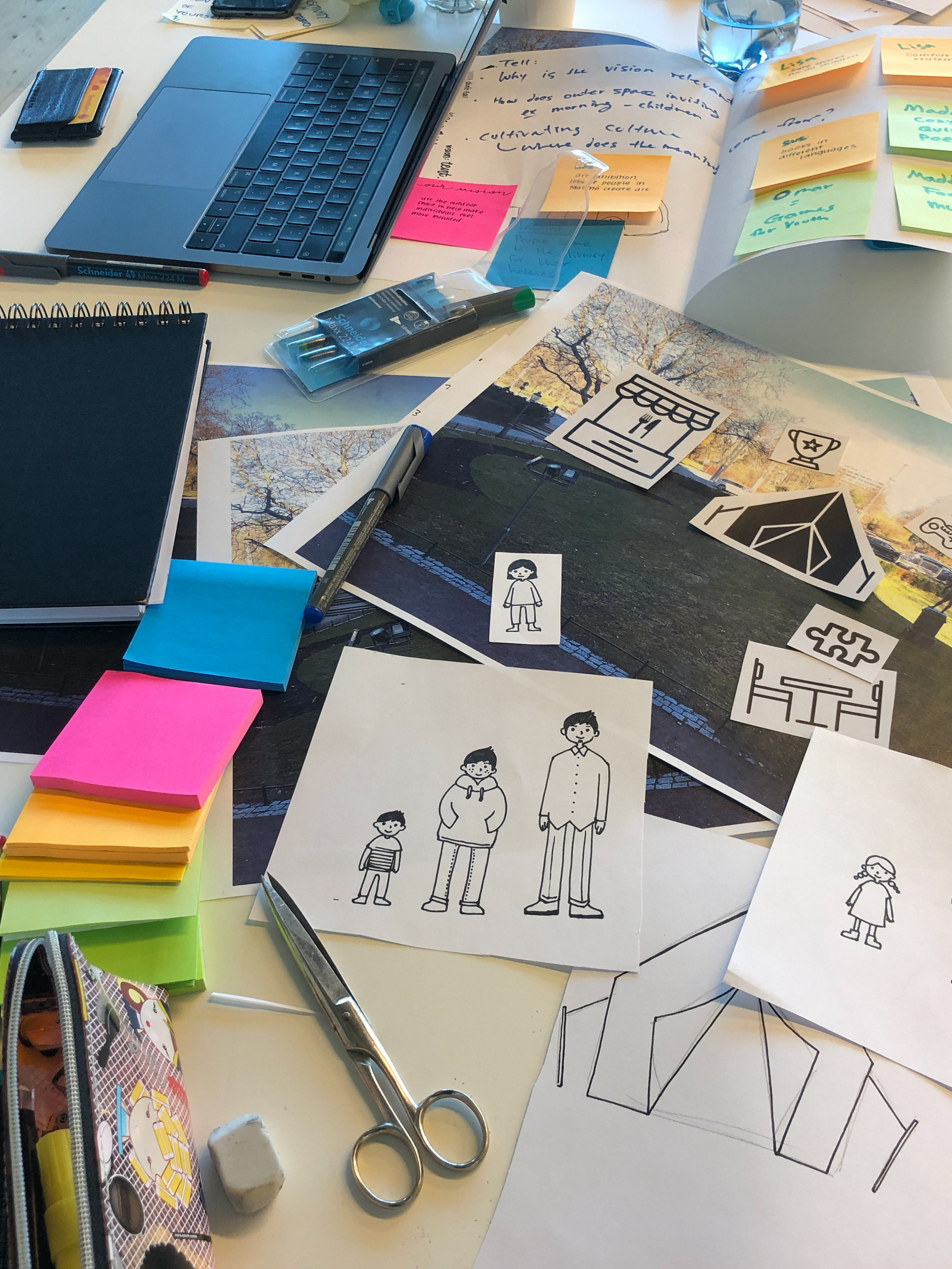
Based on insights from the interviews, I have continued with concept mapping, bodystorming, and storyboarding. During the process, I have contemplated decisive decisions. What does it mean to physicalise a moment? I have focused on the kind of bodily actions that display commitment. I refer to these body languages as rise to action gestures, and they share characteristics that are instinctive, decisive, and assertive (Figure 4). Examples of these actions can be table slamming, clenching hands, pumping fist, punching in the air, cracking fingers, rubbing hands together, clapping hands once, crossing hands together, stretching arms above head, and twisting torso side-to-side, etc. These gestures occur mostly subconsciously as a way to display commitment and anticipation before engaging in physical activity. Hence I had to heavily rely on observations and recall past memories because users were not able to recognize their own behaviors when asked on spot. Some of these actions came up organically based on what I do before committing to work, and these gestures vary depending on whether I am in front of people or alone.
Figure 4. Rise to action gestures
Figure 5. Smack your own cheek to come back to your senses.
From Haikyuu!! Season 4 Episode 16 [Image], Killa, Tumblr, (2020). (https://mystaez.tumblr.com/post/632601910217736192/)
From Dragon Ball Super Episode 84 [Image], Dragonball Wiki, 2017. (https://dragonball.fandom.com/)
On top of that, some of these actions are cultural. For example, there is a particular gesture where you slap your own cheeks to return to your senses (Figure 5). It is commonly observed in Japanese media, where characters would slap their own cheeks to collect themselves together before taking an important action. This gesture is so iconic that it is included as a skill for the Dragon Ball Xenoverse game to get your energy back and recover stamina.
Although there is a lack of study on the rise to action type of body languages, these gestures are observed to influence a person’s motivation. In fact, we are naturally gifted to practice and recognize non-verbal communications. It is fascinating that some studies show people who are blind from birth use hand gestures to communicate with other blind people, and these gestures resemble sighted people speaking the same language even though blind speakers cannot pick up these language-specific gestures by seeing (Özçalışkan et al., 2016). The hand gestures come naturally to us and they are even considered beneficial to our cognitive development. Iverson (2010) states that acquiring, practicing and refining motor skills for infants contribute to developing greater language abilities later on. Further to this, Broaders et al. (2007) found that children who use gestures while explaining math problems enhanced their learning abilities.
To add more to the topic, there is a discussion among the psychology community that human’s actions lead to motivation instead of the other way around. The action-first group made more accurate judgment of their surroundings and situations compared to the perception-first group (Franchak et al., 2010). Therefore, instead of waiting for motivation, it is more effective to start motivating yourself by performing small actions that lead to the main task because we learn better by doing. Also, behaviours that are genetically hardwired are called innate behaviours, and they are found in animals too. For example, we stretch our arms above our head after a long period of physical inactivity. These gestures are called pandiculation gestures, which “has been observed in animals during transitions from periods of low to high activity” (Parvez, 2010). Pandiculation gestures relieve tightness in the muscles to reduce the chance of injury and relieves psychological stress. Understanding how behaviours patterns are coupled with stimulus may help designers to satisfy user’s needs from the fundamental level.
I have decided that not every gesture discussed here is suitable for prototyping because it is important for users to directly touch the TUI artifacts, so the table slamming or any form on fist clenching seemed viable. On that consideration, the table slamming gesture has been chosen to be implemented in the final prototype.
Comparison Cases (Prototyping)
In order to test the user's level of engagement and commitment, I have chosen two following applications: Google Calendar as a GUI option, and built a physical prototype with Arduino for the TUI option.
GUI
Google Calendar is chosen because it is one of the most simple and accessible scheduling tools that people use on their smartphones (Figure 6). It allows users to add exercising routines that automatically sync with other preferred digital calendars as users plan their days. Plus, Google identifies walking as a sport and adds the appropriate image.
Figure 6. Google Calendar on a smartphone screen
TUI
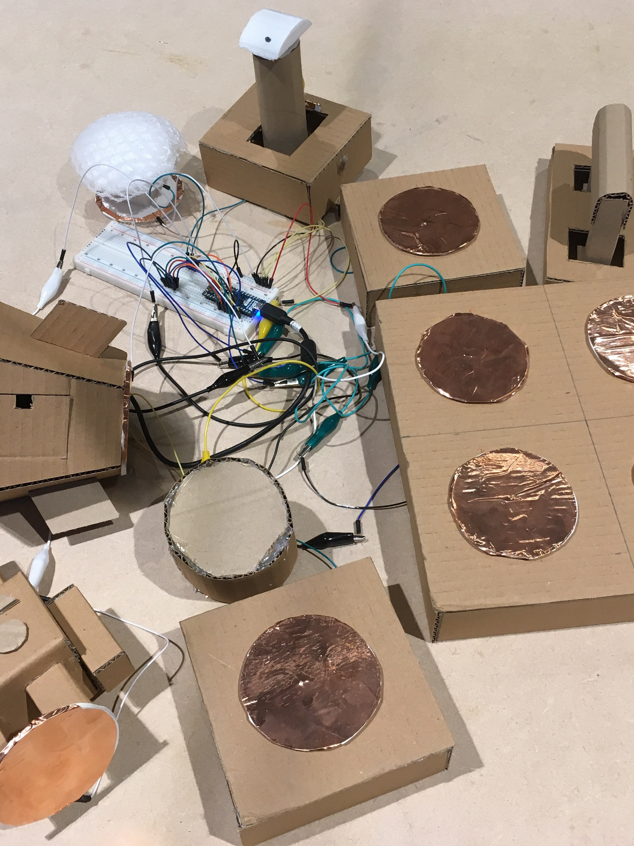
The purpose of this prototype is to help people to build a new daily routine (Figure 7). It is a high-to-medium-fidelity prototype because the shell is made of cardboard, but the inner technical components are fully functional on its own. The device allows users to physicalize the moment by detecting the rise to action gestures. This device physically manifests the user's intention by interacting with the device through bodily actions. The TUI prototype’s priority is to be able to make a fair comparison with GUI experience. Hence it was important to consider direct one-to-one comparison between GUI and TUI for fair results. To achieve this, I have attempted to be explicit by trying a few basic things and naive approaches.
Figure 7. Physical prototypes as TUI options
As for the technical description, this TUI device consists of a screen that displays a real-time clock, sound and light as a notification, two buttons to adjust the clock, 7 LED lights to visually track weekly progress, and an area to enter bodily gestures as input. The screen also gives feedback when the input is detected. Figure 8 is the Arduino skeleton that shows the technical components inside the prototype. Figure 9 shows the moment of interacting with the artifact via slamming gesture as physical input.
Figure 8. Microcontroller skeleton
Figure 9. A moment of interaction
The following instruction explains how to use the device: (Link to Video)
1. First, decide on the task and set a time.
2. The task must be easy and digestible.
3. The notification turns on at a chosen time.
4. Turn the notification off with a decisive gesture.
5. This means a start of the task.
6. When finished, use the same gesture to log complete for the day.
7. It tracks 7 days of progress.
Figure 10. User Flows
User Testing
The comparative user testing has been conducted to test interaction with GUI and TUI for 7 consecutive days each. Before setting up Google Calendar and TUI prototype, there has been a brief conversation about the participant's usual daily activity level, and agreed on specific tasks and time. Then the users are informed how to operate each prototype and practiced before sending them off.
The participant’s activity level has been discussed before the test began because previous interviews revealed that people are interested in improving their sedentary lifestyle with some kind of physical activities. The participants had freedom to choose their preferred time of day and tasks, as long as the task is simple and digestible. This is based on the behavioral theories mentioned earlier, regarding how users are more likely to engage in action when a big task is broken down into smaller tasks. Most of the participants have chosen to perform a light physical activity such as taking a short walk, stretching before bed, and 10 push-ups everyday, with one exception that one of the participants wanted to read because he is already quite active. Since each user testing sessions are long and demanding, it has been difficult to find eager participants on such short notice. On top of that, unfortunately, not everyone has completed their sessions. We have started with 3 people with GUI user testing, but 1 person dropped out. After that, only 1 participant was able to participate in TUI testing, so the data is extremely limited. By the end of 7 days, the users were asked how it went, whether they were able to keep up with the tasks or not, and how they felt.
The GUI user 1 neglected muscle training because he thinks it is a hassle to go to gym. He felt that he still needed to train his muscles but was frustrated that he kept putting it off, so he took this as an opportunity to finally give it a try. He chose to do 10 push-ups at 12:00, right before his lunch. He entered the schedule on Google Calendar by himself, then tagged me. From the very beginning, he set up sticky notes on his wall to keep track of daily progress (Figure 11), which proved the need for physical tracking on TUI. He started off with high motivation and he performed the task consistently for 5 consecutive days, until he went on a business trip. He mentioned that at a certain point, the reminer was almost not needed, but he still waited for the alarm to sound before doing the push-ups. He said he was late on day 2 because his phone was on silent mode. He felt neutral to miss the notification because it is just a sign to do the task. He usually keeps his phone muted because he finds the majority of notifications to be annoying. He even muted the group chat for work, and only kept notifications for emails, Facebook messenger, and Instagram just to keep in touch with family and close friends. However, in the case of building a new routine, he thought it was helpful to keep the notification on. He did not mind the beneficial type of notifications that are relevant to his life and goals. While doing push-ups, he felt good because he was doing what he set out to do. Then the business trip threw him off the track. On day 5, his flight arrived at noon and his phone was on airplane mode. Instead, he did the push-up at his hotel at 14:00 because the task was still on his mind. However, he deliberately decided to ignore the tasks after because his environment changed. He was no longer working at home, and he was busy networking at the conference. He said he could have done the push-ups in the quiet area but he chose not to because the task was the furthest thing from his mind. He reflected that the last 2 days undid the 5 days worth of routine building progress and felt like he will have to start from scratch again. Despite that, he enthusiastically expressed that he had fun when he got into the routine and he actually looked forward to doing the task.
Figure 11. The user set-up sticky notes to keep track of his progress while using GUI.
On the contrary, GUI user 2 felt differently compared to GUI user 1. The GUI user 2 has two children and she does not exercise at all. She agreed to stretch everyday at 21:00 but asked me to set up the Google Calendar schedule on her behalf. In general, she commented that it was not a good time for her to make any changes in her life because she was stressed with the upcoming deadlines and also got mildly sick. She did not stretch once and ignored the notifications the whole time because she was either busy, sick or feeling down. So when she saw the notification, she just wanted to decline. Although the GUI user 2 did not verbally express it, she showed signs of guilt and discomfort for not following through the plan. She justified her actions by stating that she “even ignores more important matters, such as other people”. She confessed that she did not truly want to stretch everyday, but she only wanted to be helpful. This proves once again that intrinsic motivation is critical to changing a routine. Also, her unstable situation is not an ideal time to build a new daily routine. In this case, it is likely that it would not have mattered whether the user was interacting with GUI or TUI.
Lastly, the TUI user is already an active person, so he agreed to read a few pages of a book everyday at 18:30, even though he seemed reluctant at first. He said that on paper, he did not miss a day, but he was late on day 3 and 4. He mentioned that his “emotional experience was tedious” in the beginning. On day 2, the thought of needing to read later made him not look forward to 18:30. He further described that the physical presence of the TUI object felt like “a dark hole in the room” due to emotional pressure because he dreaded the time leading up to reading. Another factor that frustrated him was dysfunctioning alarm. He had to be in close distance to the TUI device to notice the alarm. Also, he could not hear the alarm while wearing headphones, and he could not carry the device with him. Hence he would only notice the device as he left or entered his room. He felt most upset on day 4 because he was constantly missing the alarm. The fact that the alarm did not serve its purpose to remind him properly made him frustrated. Since he was constantly late, he did not feel good about himself and it bothered him that it was not the time that he agreed to do the task. On day 5, he deliberately stopped relying on the alarm and took initiatives to read on his own terms and used the TUI device only to keep daily progress. Once he started reading, he got into it and read more than he promised. He believes his level of concentration had nothing to do with the book because the book was non-fiction. Instead, he got into the act of reading once engaged. He felt good that his action was under his own initiatives, and said it felt satisfying to slam the TUI device. He commented that the bodily motion was good to start and end the task because it felt concrete. Also, he enjoyed the visual progress, and making all the LEDs light up was one of his main motivators to continue. In the end, he felt empowered. His experience transformed from a negative burden to a positive visual reminder.
Findings
- TUI is not exactly better than GUI
- User's unstable environment has been more critical to the plan
- TUI-based notifications are not as effective as GUI because users cannot carry the TUI device at all times
Strengths of the TUI:
- Stronger emotions
- Greater attachment
- Feels conclusive & satisfying
- Lasting impression
- Promise of better sustained results
The tactile nature and bigger bodily actions form deeper emotional investment (Figure 12).
The smartphones are superior as a notification tool, but they lack something tangible to ground the following action.
Figure 12. User’s emotional journey mapping
Conclusion
There is potential benefit to blending GUI for notification, and TUI for input. Having a tangible device in front of you is harder to ignore compared to simply closing an app.
References
Broaders, S. C., Cook, S. W., Mitchell, Z., & Goldin-Meadow, S. (2007). Making children gesture brings out implicit knowledge and leads to learning. Journal of Experimental Psychology: General, 136(4), 539–550. https://doi.org/10.1037/0096-3445.136.4.539
Franchak, J. M., van der Zalm, D. J., & Adolph, K. E. (2010). Learning by doing: Action performance facilitates affordance perception. Vision Research, 50(24), 2758–2765. http://doi.org/10.1016/j.visres.2010.09.019
Maeng, S., Lim, Y., & Lee, K. (2012). Interaction-Driven Design: A New Approach for Interactive Product Development. Designing Interactive Systems Conference, 448-457. http://dx.doi.org/10.1145/2317956.2318022
Iverson, J. M. (2010). Developing language in a developing body: the relationship between motor development and language development. Journal of Child Language, 37(2), 229–261. http://doi.org/10.1017/S0305000909990432
Özçalışkan, Ş., Lucero, C. & Goldin-Meadow, S. (2016). Is Seeing Gesture Necessary to Gesture Like a Native Speaker?. Psychological Science, 27(5), 737–747. https://doi.org/10.1177/0956797616629931
Parvez, H. (2021, May 10). Body language: Stretching arms above head. PsychMechanics. https://www.psychmechanics.com/body-language-stretching-arms-above-head/

